Part II: Electric Boogaloo
So here is the design I’m going to work on touching up for the t-shirt. Enjoy!
Or, we could do this super cute design ;)
Part II: Electric Boogaloo
So here is the design I’m going to work on touching up for the t-shirt. Enjoy!
Or, we could do this super cute design ;)
Comments are closed.
Jere! A couple of questions, I would love to use the sun face that’s on the website here, do you still have that original image and how big is it? The one I have right now is kind of blurry so I was thinking of making my own sun face to make it the right size so that the image didn’t look fuzzy.
I have the original. Way back when I made it I ran into the same problem (blurry, not good quality), I wanted one that was clear and that could scale really large if needed. So I had to make it from scratch in Adobe Illustrator. I have it somewhere, let me know what format you want it in and how large you need it.
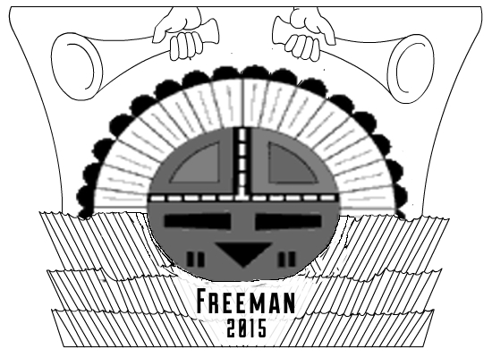
Becky and I were also discussing the design last night. What are the thoughts on scaling it back a little by taking out the Nauvoo imagery and going with just the Hopi sun face. Then the text would read Freeman, 2015, Nauvoo, IL somewhere.
I was just thinking the graphic should be a symbol of our family, not necessarily of Nauvoo. The Nauvoo part isn’t as important. I think a simpler design would increase the re-wearability of the shirt after the reunion.
No biggie either way, if we’re getting shirts, I want something I’d wear after the reunion too.
Personally I think it is funnier/cleverer to leave it as the “sunstone” thing.
Just a printing-related thought–if we are getting this done in only one color (which probably is what we need to do to keep costs down), then we probably need to have everything just as a line drawing–that is, no shaded portions in the image. Having various shades of grey still counts as having more than one color. It should be JUST black and white. So essentially, fill the turquoise bottom portion in white, then outline the inside wedges in the top parts of the face with black, then fill with white again inside and outside that outline. Make sense?
Jere or Matt, could you do that?
It would also make the design a little clearer and more striking, I think. If we aren’t going to do color, let’s not do all the grey. What do you think?
I don’t wear funny or clever. Most the t-shirts I wear all have simpler designs (Adidas, BYU, Dodgers, or Michigan). Nauvoo has no real family symbolism for me.
I agree with Jere about the Nauvoo part not being as important. I’m a simple design guy too. And while I agree with Andrea on the cleverness, WE have the “fullness of the gospel” perspective to see how appropriate this superimposition may be. But the Hopi community at large may not appreciate a cartoonization of a significant religious figure.